The literary classic Romeo and Juliet proposes the idea of “what’s in a name?”
A rose by any other name …
Perhaps the same could be said for car logos? Granted, our performance cars are probably going to handle just as well; our trucks will haul just as much, and our SUVs are going to seat just as many, regardless of what the logo looks like.
Yet, like names often do, car logos have an individual story.
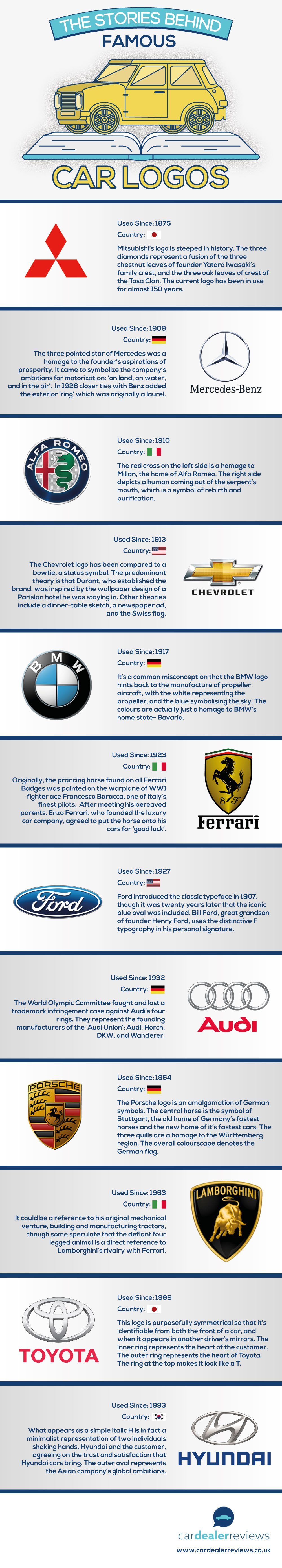
This fascinating graphic from our friends at Car Dealer Reviews shows the origins of certain car logos. The four rings of Audi, for example, actually represent the merger of four companies. And the Hyundai logo is more than just a letter inside an oval.
Do you drive a particular car based on a logo? Do you get a certain sense or feeling when you are driving a vehicle with a specific logo?
*Carl Anthony is Managing Editor of Automoblog and resides in Detroit, Michigan
from Automoblog.net http://www.automoblog.net/2016/01/29/visual-history-car-logos/
via IFTTT
from Tumblr http://peternpalmer.tumblr.com/post/138320104706
via IFTTT
No comments:
Post a Comment